Parallel universe
These are the Pilot Parallel calligraphy pens; and the short summary is they're very good... but there's a bit more to it than that, because there always is.
I got them out on Monday night, feeling in need of something to calm me down as I'd had a horrible day. Some chancer attempted a fraudulent transaction on my debit card while I was in the kitchen getting lunch ready; I don't know how they got hold of the details, because I make 100% of my purchases online (there are no shops here), and most online shops go through something like Shopify or similar, so none of their staff get to see customers' card details. Normally this would just have been a minor annoyance, but there were a few unrelated things going on which, when you put them all together, raised the stress level from 😦 to 🤯 in fairly short order. I was still feeling pretty rattled by tea time, so I thought, right. Calligraphy time. That'll help.
The pens look pretty elegant. You have an off-white barrel, quite long and tapered at the end in approved calligraphy-pen style, and each pen has a colour-coded cap so you know which one you're using. They come in several different nib widths; I have the 1.5 mm (red cap) and the 3.0 mm (fuchsia pink cap). I bought 12 black cartridges (they come in packs of six, and they are specially designed for that pen) and a pack of 12 in assorted colours; having said that, each pen is supplied with a black and a red cartridge, which I hadn't realised. Each pen also comes with a squirty bulb attachment for flushing water through the pen to clean out the nib unit as a whole (a really good idea - why don't all cartridge pens come with one of these?) and what they call a nib cleaner, which is just a little piece of thin flexible black plastic film that you can insert between the parallel plates of the nib to remove dried ink deposits and any other accumulated gunk.
So far, so good, until I tried to get the cartridges in. At this point I was thoroughly puzzled, not to mention frustrated. I was trying to push the cartridge onto the top of the nib unit, as you do; but there's a semicylindrical plastic flange about 5 mm in height on one side of the top of the nib unit which was physically preventing me from doing so. It clearly wasn't some kind of glitch, because it was the same in both pens. After several attempts I went on the SCA Discord server, found the scribal channel, and typed a heartfelt plea for help; and within seconds I got a friendly scribe who had some of these pens and could assist.
It took both of us a little while to work out what was going on, but finally we cracked it between us. I was, believe it or not, trying to insert the cartridges the wrong way round. The scribe really didn't blame me; she said the design was very counter-intuitive. The cartridges have a slightly narrowed end with what looks exceedingly like the sort of seal you press into a nib unit, and a flat end which looks from the side just like a solid cylinder... but it isn't. There is an indentation in it which goes over that flange I couldn't make any sense of, and the flange breaks the seal at the base of that indentation. That, really, is the only piece of poor design about these pens, but it is quite a significant one till you get the idea. I can imagine a lot of people who don't have nice SCA scribes to help them are puzzled for quite a long time.
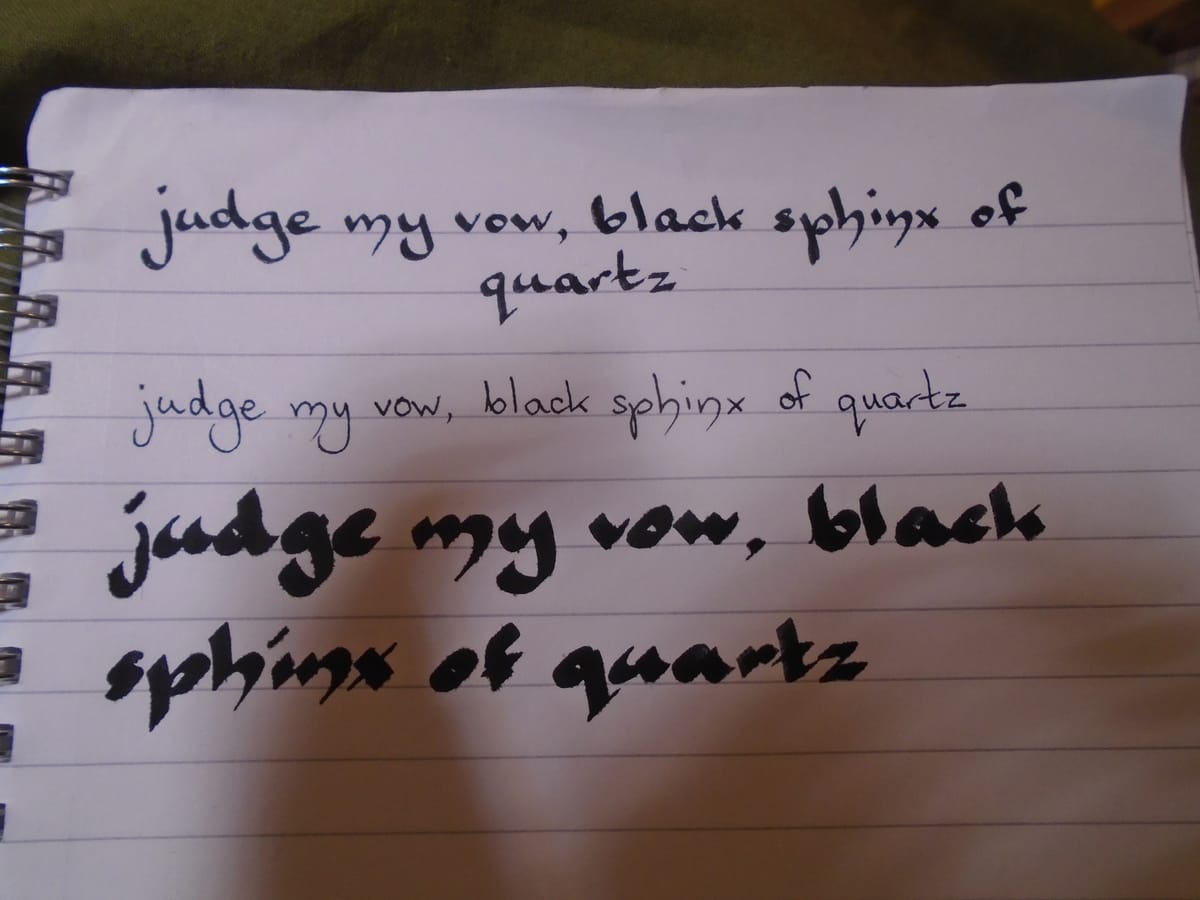
Once that was sorted, I put the pens through their paces. They are quite unusual in that you can also use the side of the nib for a thin line; whichever pen you're using, this is 0.5 mm. Hence the top line in the feature photo is written with the 1.5 mm nib at the regular angle, the second line is written with the side of the same nib (and, as you can see, there's no appreciable difference between thick and thin at this level, so this doesn't really count as calligraphy in my book), and then the third is written with the 3.0 mm nib... which is really a bit too thick for this notebook, but it gives some beautiful effects. I mean, look at that "h" in "sphinx". Just lovely, and I wasn't doing much with it consciously - the pen did all the work.
Well, that's just my basic calligraphy hand which I developed in my late teens; it hasn't really changed at all since. How about a proper uncial? Let's see:
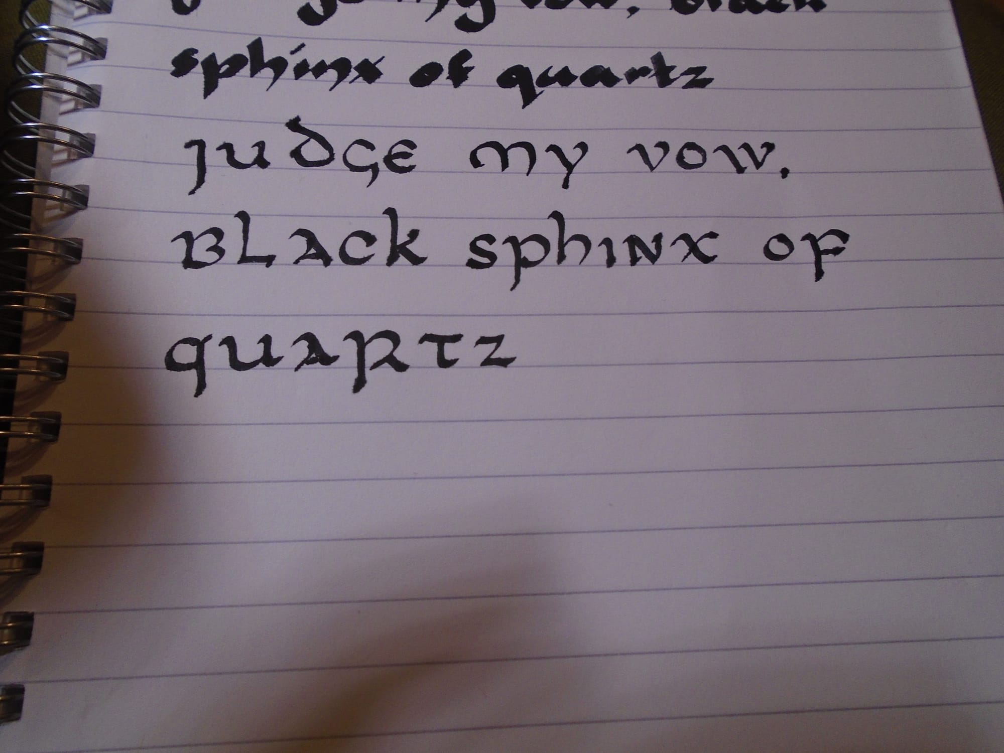
I was copying the letters from a source I found online here; it didn't give a date, but I think the letterforms are fairly early because not many of the letters have recognisably lower-case forms (uncials evolved from Roman capitals originally). Having said that, it will have been tweaked to suit the modern alphabet. The Romans did not have a separate J or W, using I and V for these letters, and it took a while for them to appear in historical scripts.
What you did get, and in great quantity, was scribal abbreviations. It made sense at the time. Copying out manuscripts was a slow process even if you weren't also illuminating them, and paper (for which also read parchment, vellum, and so on) was not cheap; so these abbreviations saved both space and time. The closest parallel today is probably abbreviated Braille. Braille books are very bulky, so a whole list of abbreviations has been developed for common words in order to reduce that bulk at least to some extent. But to the modern sighted reader, mediaeval abbreviations can be pretty confusing; there is, for instance, an abbreviation for final -er which looks very much like -o, so it is quite hard not to hear the script in a broad Sheffield accent (which does tend to pronounce unemphasised final -er as a short -o, something I found very odd when I first heard it).
However, I think I'm not going to bother learning those. I'm not copying out entire books by hand, and I can get paper at a reasonable price. So I think where I go from here is I try out a few more different hands and then see which one I'd like to concentrate on learning; the uncial script is quite nice but I may find one I like better. And I may also try a little illumination; the inks for these pens are designed to blend, which could well have its uses. Any excuse to stick in some Celtic knotwork!
Eventually, perhaps, I shall become good enough to be able to produce a scroll for someone, which I'd like to do. Thankfully, if you're doing that, you do not have to buy the paper for it yourself, because the paper which appears to be most favoured is this stuff, which, as you see, is eye-wateringly expensive. (You can use any archival-quality paper; normally it has to be at least 250 gsm, which is pretty nearly card, but the Pergamenata stops at 230 and it is beautiful quality, so they make a slight exception for that. It is apparently the nearest thing you can get to actual parchment while being vegan, and I've heard several scribes say they like it better to work with than the real deal.) But in the meantime, I'll just muck about with a cheap notebook from Ocado; it's fine for practice.
Now if I can just find a mediaeval hand that looks something like my natural script, I'll be in clover!
