Chromatic fantasy and fugue
This applies to a lot of other creative crafts as well as beading; so if beading isn't quite your thing, you may still find something here that resonates. I'm going to talk about colours.
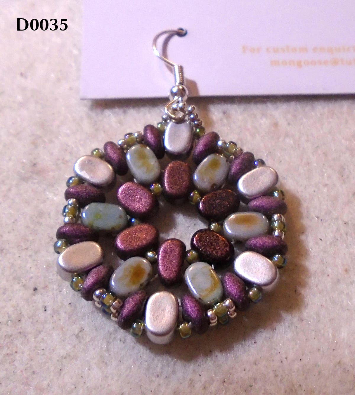
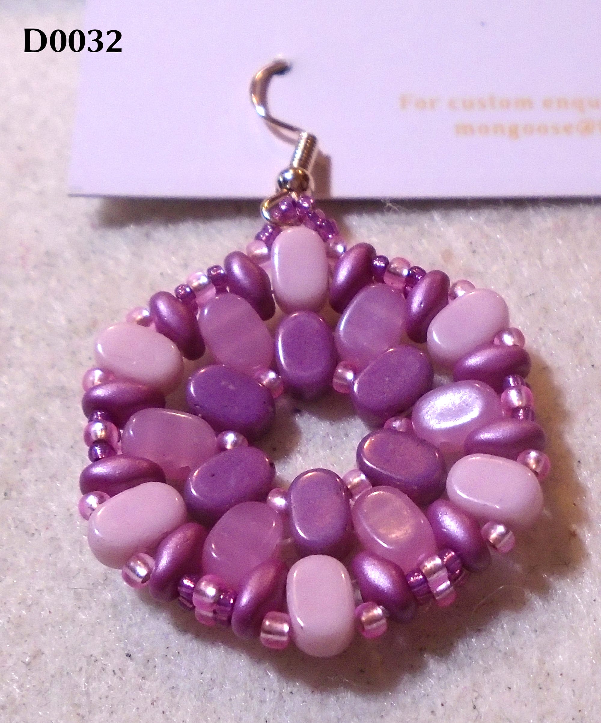
Sometimes, colours are really easy, and there is a superb example in the feature photograph, although that's not what I chose it for. The Lipsi beads in the central ring and the SuperDuos (the narrower ones) around the outside are not only almost exactly the same colour, but they're even the same sueded finish, although they're made in different countries by different manufacturers (the Lipsis are French, and the SuperDuos are Japanese). I strongly suspect one manufacturer had a look at the other one's beads and thought "h'mm, a lot of people like to use these two kinds of beads together, it'd be a good idea to match those". And then you get other beads that don't match but they do tone nicely; so, again with the hexagons, you can do something like this:
And at other times, they're really not easy at all. Those bluish beads in the feature photo (which actually look rather bluer than they are - you can just about tell they're meant to be blue in real life, but they're very close to grey) looked nice on the website, and they look nice when you see them, but oh my, they are the very dickens to work with. They're called Chalk Lazure Blue, which is puzzling on all three counts. First of all, they're not chalky; they have a bit of a shine to them. (The purple central beads in the second photo are called Chalk Vega. Vega? I thought that was a star, not a shade of purple. Also very much not chalky, so I have no idea what "chalk" means in this context.) Secondly, I know what "azure" is (and they are definitely not it), but I've never heard of "lazure". And finally, they're only just blue. In the right light. If you squint. Hard.
When I ordered them, I thought "oh yes, another blue - that's fine, as it'll give me more blue combinations". Actually, no, it doesn't. Chalk Lazure Blue does not look good with any of the blues I already have. It blends beautifully with the greys, but the result is drab, to say the least; I'm very happy to use greys and other neutrals, but I reckon the point of them is to make other colours really pop. Case in point:
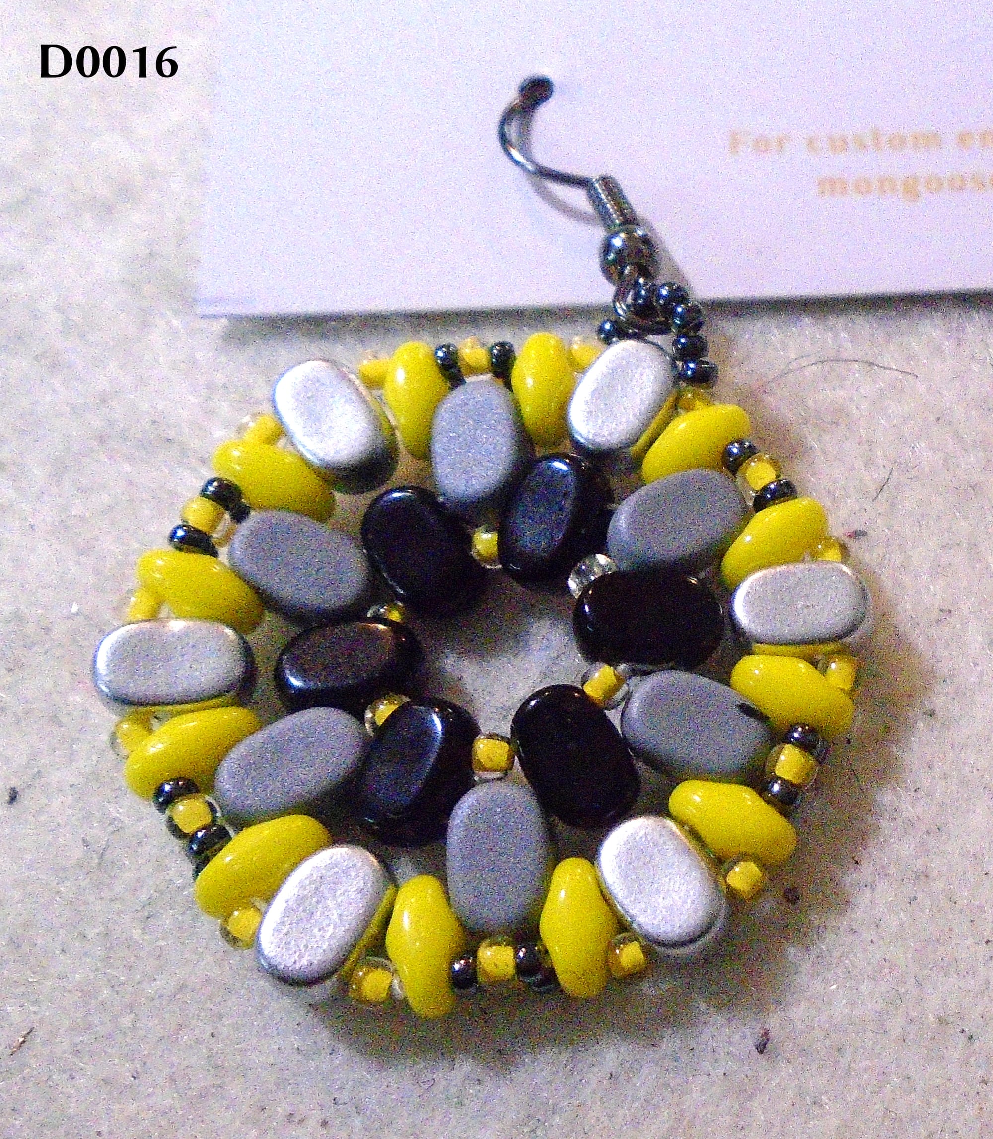
So the question was "what can I use this with which will look good?", and it took me quite a while to come up with the dark purple. It does, to be fair, work equally well with gold or silver, but sadly not with much else! If I'd seen it in a shop I'd have rejected it immediately, because I'd have seen that it wouldn't work with anything much; but it's much harder to tell that on a website. I won't be buying any more, and that's rather a pity, because I like that antiquey finish. Having said that, I am pleased with the earrings I put them in. They came out kind of moody and Wuthering-Heights-ish. Not really my vibe, but someone out there is going to be all over them.
And then there's this:
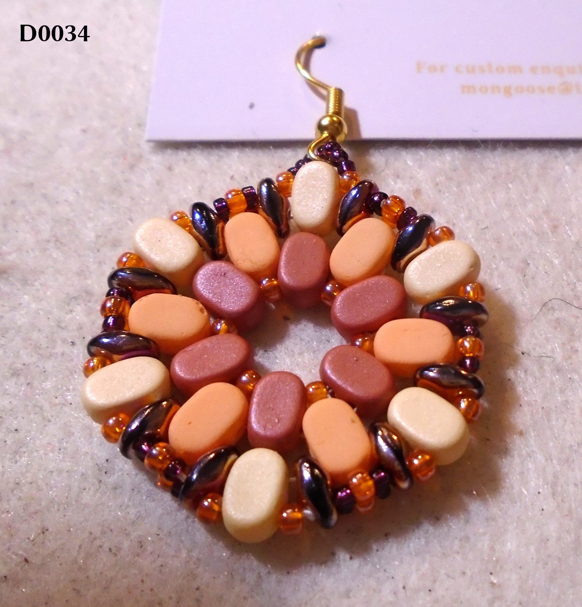
The Lipsis on the outside (the colour is called Stone, but it's more of a sort of cream/biscuit colour - may look a little more orange/peach on your screen) are new, so I wanted to use them; I also wanted to run down the terracotta in the middle, another colour I've been struggling a little to use (though the colour in between, which is called Peach but is definitely more of a light orange, has helped with that). So I laid out these three sets of beads on my tray, and then I needed to choose the SuperDuos. I have a orange which is almost identical to the Peach, so I very nearly used that, but then I thought... wait. The Jet Sliperit would give it a bit of drama, and it has orange reflections so it would work. Fine. I then picked out the larger seed beads, the orange ones, and was briefly stuck for the smaller ones till I noticed that the Jet Sliperit SuperDuos also had burgundy reflections. Orange and burgundy? That seemed like a bit of a weird combination. Would it work? Especially with the terracotta sitting in the middle?
Well... judge for yourselves, but I think it does. Triumphantly. That's part of the fun of multi-reflective finishes; they can reconcile some quite strange combinations.
Let's have a change from hexagons:
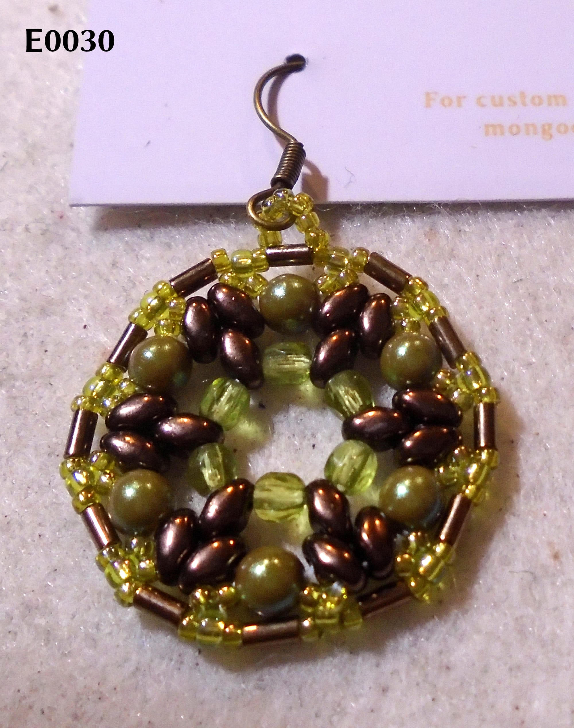
I've recently acquired both bronze MiniDuos and bronze bugle beads. I've already been using a fair bit of that colour elsewhere (I have bronze 15/0 seed beads which are very useful, in particular for harmonising with that Crystal Full Amber colour - it looks much better pretending to be light bronze than pretending to be gold); but I thought, well, what do you do with a substantial amount of bronze? Then I noticed the glass pearls (I think the colour is just called "iridescent green", but it's definitely in the olive zone, as you see), and I thought "actually, those are kind of bronzey, but different enough to contrast - let's go with olive". I loved the result. There's still a contrast - even quite a high contrast - and yet the whole lot looks made to go together.
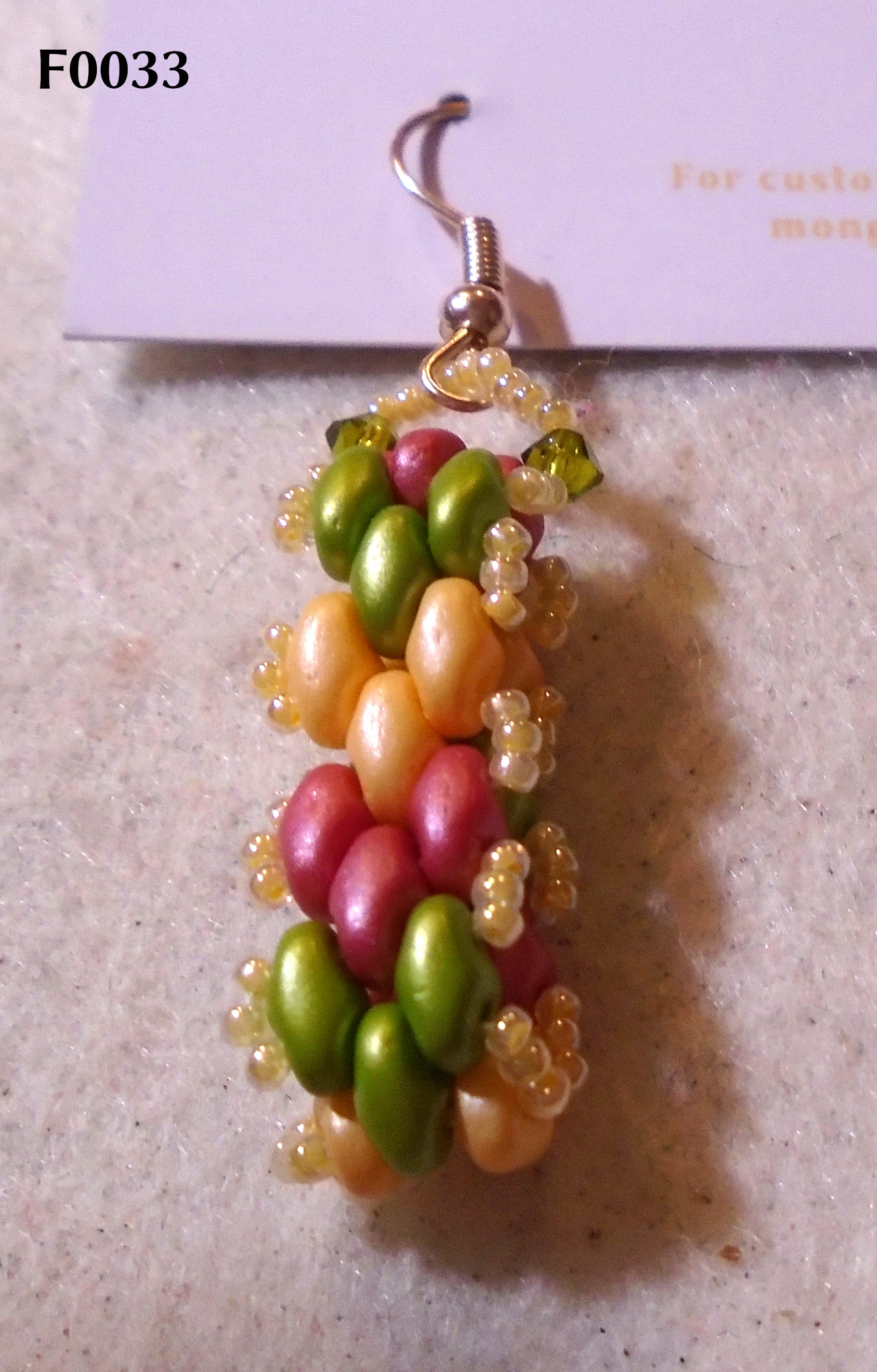
And finally, here's a fun one. I love the way colours look different depending on what you put them with. So this one has a kind of muted traffic-lights effect; but, if you look at the beads separately, only the green is actually what it looks like. The "red" isn't red at all, but another terracotta (all right, a bit pinker than the Lipsi one so they don't work that well together, but still, you wouldn't call it red). The "yellow" is, in fact, that orange colour I mentioned which is almost identical to the Lipsi peach. And those seed beads pulling it all together (both literally and in terms of colour) around the edges and on the hanging loop are a lemon yellow which isn't actually that close to any of the main bead colours - it just happens to work nicely with all of them.
I could go on. Colour is a hugely fascinating subject, and the most fascinating thing about it of all as far as I'm concerned is that I've been looking at, and appreciating, colours all my life, and yet they still have the power to surprise me. Orange and burgundy, anyone?
